How to Pair Fonts: A Simple, Fun Font Pairing Guide

Ever spend way too long picking fonts?
Same. But once you get how contrast and rule-breaking work, it actually gets a lot more easy and fun.
Font pairing can be tricky. You look at two fonts and think, “These should work together,” and then… they don’t. For me, it’s something you only get better at by messing around and seeing what feels right.
Here’s how I work with fonts.
Start with curiosity
The best advice I can give: be curious. Try stuff. Mix fonts you normally wouldn’t. Play with scale, weight, and color. You’ll start to notice patterns: what feels balanced, what feels off, what actually surprises you in a good way. Sometimes the best designs come from total accidents that just happen to click.

Learn the rules
Typography has its official rules, and they’re good to know. Basically, give each font a clear job (headline vs. sub-header vs. body copy), and keep it to two or three fonts max. Also, make sure it’s readable.
An example of breaking the rules
Legibility is important… unless you’re using a font for creative or artistic expression. For example, the 1960s psychedelic art movement, especially poster design, had a wild, trippy approach to typography. Often, the fonts were hard to read. The distortion wasn’t a mistake; it was intentional, designed to attract the counterculture crowd .. young people into rock music, freedom of expression, anti-establishment ideas, and the psychedelic experience itself. The designs weren’t just meant to be seen; they were meant to be an experience, reflecting the same surreal, reality-bending feelings as the psychedelics that inspired them.
So for these psychedelic posters, immediate readability wasn’t the goal.
Here’s some poster examples by Wes Wilson.

When legibility is needed
Other times, readability is essential, like when you need viewers to understand something quickly. Think advertisements, articles, website sections, or signage. Road signs, for example, must be legible from a distance to convey messages safely and accurately.

Key rules that make text legible or easy to read
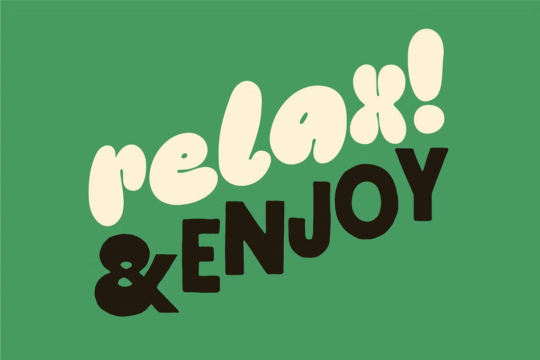
 Fonts used: Very-Tiny, Baddie, Oddball-Tall
Contrast
Make sure there’s enough contrast between your text and background so the words actually stand out.
Size
Keep your font size big enough to read comfortably, whether it’s on a screen or in print.
Spacing
Give your text room to breathe. Space out lines, letters, and words so nothing feels cramped.
Typography
Pick fonts with clean, clear shapes. Save the fancy stuff for headlines, not body text.
Layout
Stick with an easy-to-follow alignment, like left-aligned. Centered or right-aligned text can look cool for shorter copy, but for long text blocks, it’s harder to read.
Now for pairing fonts
Often, the main thing is contrast.

You want your fonts to look different enough that each has a function or hierarchy, but not so different that they feel like they’re from completely separate worlds. Big vs. small, heavy vs. light, classic vs. modern. Contrast gives your design hierarchy, emotion, balance, and rhythm.
Key rules for font pairing

Mix font styles
Pair a serif with a sans-serif, or a script with a sans-serif, or a reverse contrast slab-serif with a lighter traditional sans-serif. There are many, many possibilities. Mix and match to create an appealing contrast. It’s one of the easiest ways to make your design feel balanced and interesting.
Contrast weights
Use different weights to make text distinct without or without changing the font family. For example, a bold heading paired with a light body font naturally guides the reader’s eye from big to small, dark to light.
Avoid conflict
Don’t pick fonts that are too similar, it can be confusing and look like a mistake. Similarly, avoid fonts that clash too much, like two ultra-creative display fonts with lots of details. Sometimes this leads to them fighting for attention and makes your design feel chaotic. (That said, if a little chaos is intentional for your design or brand, go for it.)
You can use font families

A safe way to keep harmony is to stick with fonts from the same family. For example, an Extra Bold and Regular version of the same typeface usually pair well, creating a unified, stable feel.
Build hierarchy
Most designs need a primary font, usually the headline. Then use smaller, lighter fonts for body text. Size and weight differences guide the reader and make content easier to follow. Our eyes naturally go to the boldest, brightest thing first, then move down the hierarchy, which is a handy tool when pairing fonts.
Keep it readable and minimal
Limit yourself to two or three fonts to avoid clutter. Make sure your text is readable at its intended size. Test pairings in context. What looks good on your screen might feel different or be unreadable in another scale.
Have fun breaking the rules

Once you understand the basics of type design and font pairing, experiment. Try pairing two decorative fonts or mixing an ultra-fancy script with a rough, plain sans-serif. Maybe make the line spacing super tight and leave no breathing space along the edges so the design feels bold, condensed, and heavy. Maybe it seems like a bad idea, but sometimes it works. The key is intention. Break rules to add something meaningful, not just to be rebellious.
Breaking rules with purpose looks cool. You can create energy, tension, or something unexpected that makes people stop and look.
Final thoughts
Font pairing isn’t about memorizing rules or chasing trends. It’s about understanding the basics, trusting your gut, and being willing to play. Learn the rules well enough to break them confidently. That’s usually when the best stuff happens.
Like this Article? Sign up for Art Notes for new ones delivered strait to your inbox.
-Kelli